1- The Color Palette
I don’t have a very good eye for color myself, but I have noticed a couple of things about the color usage. The show’s style doesn’t rely on this as much as the other elements
Many of the shots have a split-compliment color palette, and use color temperature to create contrast.
Let’s take a look at this shot from Season 2, Episode 19 O Titan, Where Art Thou, at 00:46:
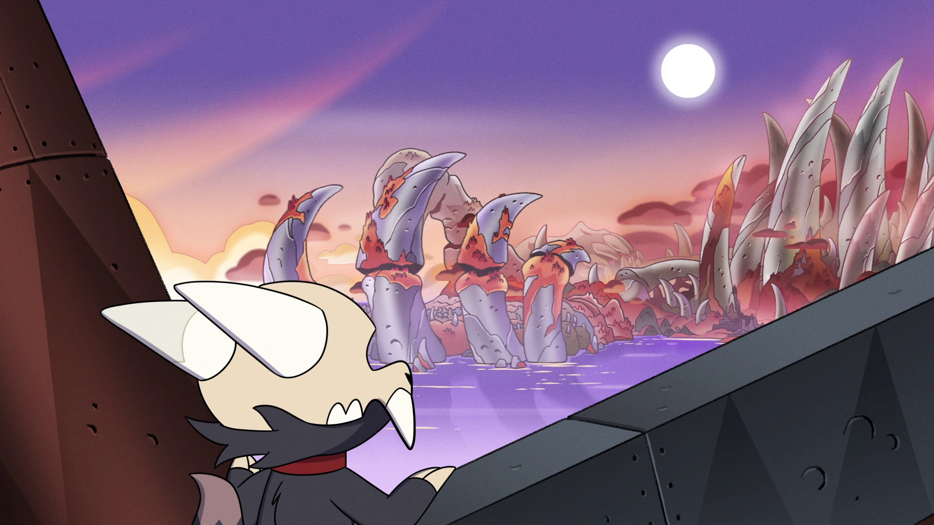 The sky and the water are analogous: Warm purples, reds, magenta hues. The orange trees (Were these the Wrinkling Oaks Lilith mentioned in Elsewhere and Elsewhen?) are very, well, orange, and feeds into the autumnal and halloween-y atmosphere of the entire show. (Side note: Do the boiling isles have seasons? It’s implied that they do, but I don’t see any change over the course of the show.) The bones of the island itself, however, are made of cool greens and purples.
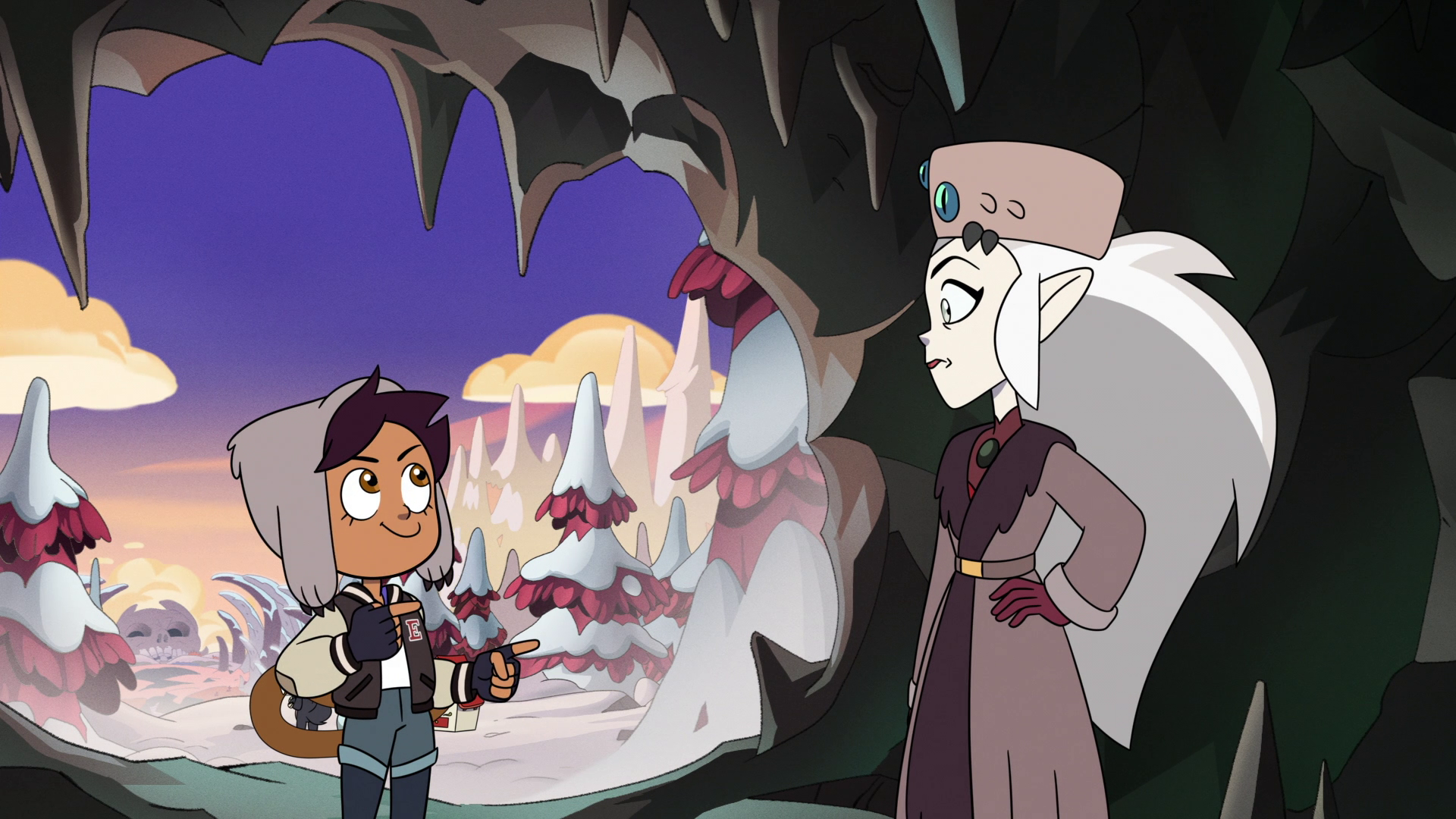 Later in the episode, we join Luz and Eda on the snow-capped summit of The Knee. We are in an ice cave, and have a view from behind them looking out onto the island. Again, color temperature- match the orange glow of the sunrise, reflecting a faint yellow light off of the snow on the red-violet trees, against the cold green ice of the cave/vein they’ve taken shelter in. It draws our eye to the focus of this shot, which is Luz. I’m sure her placement backlit by the sun is some sort of cinematic message, as well.
Let’s take a gander at something spookier. Going back through the season, my mind draws me to an episode where the kids find themselves in places they shouldn’t be; Season 2, Episode 5- Through the Looking-glass Ruins.
In this scene, Gus, Mattholomule, and the Glandus hooligans are traveling through the brambly woods to find the Looking-glass Ruins.
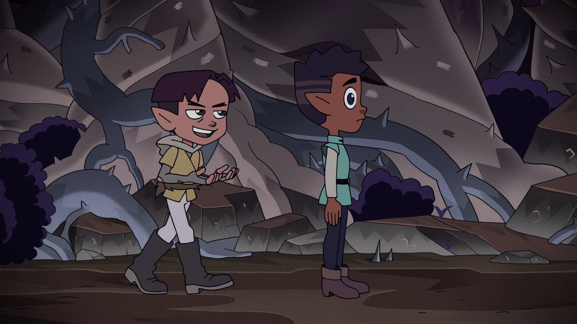 Here we can see a much darker tone than before, to emphasize the spooky woods our characters find themselves in. But if you look closely, you can still see that we have a complimentary color scheme for some visual interest. The trees are ever-so-slightly warm, and the brambles are an obvious blue. The normally red grass gives way to an almost-brown orange ground. This very unsaturated color palette then gives a background for the purple bushes to pop, as well as the characters. (And yes, I did choose this frame because I thought gus looked funny.) Notice that the characters, while saturated, are darker to match their environment.
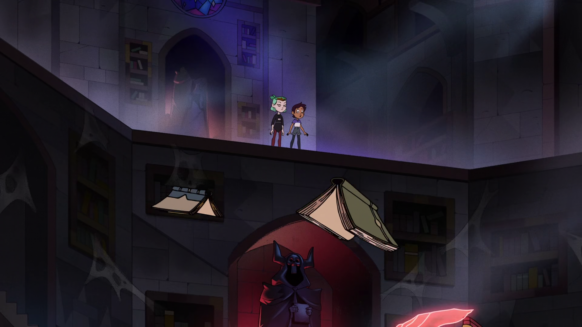
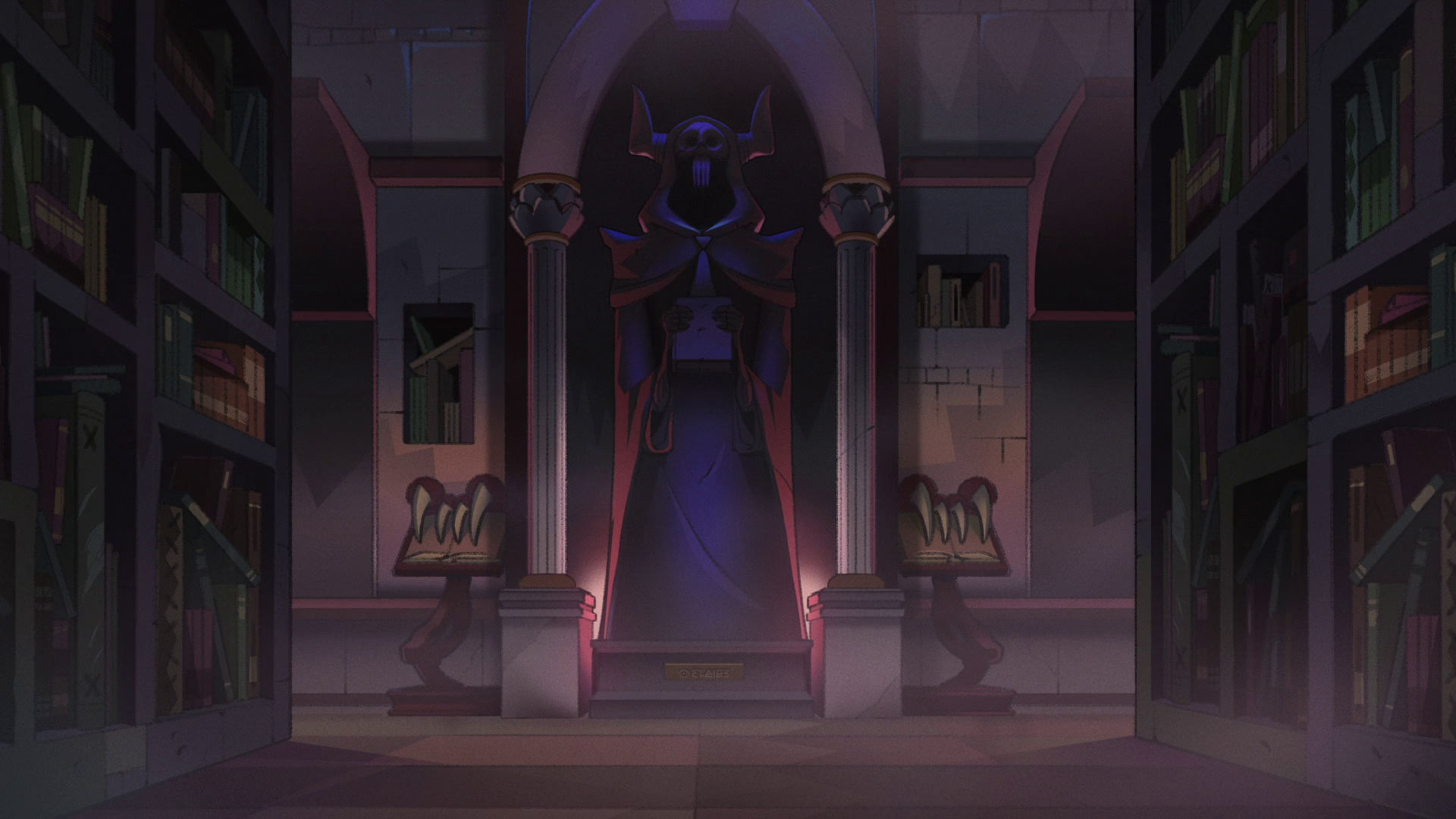 In these two shots of Luz and Amity within the Forbidden Stacks, we can see more colors at play here.
We can see a lot more of the cool/warm contrast here. The Forbidden Stacks are dark, cold, and largely inhabited by echo-mice, flying books, and cobwebs. The stones are lit a cool color, with a faint green-blue haze over it, like a haunted Skyrim basement. The warm red light cast from behind the statues draw our eye to the foreboding imagery. The girls are, however, as saturated as ever, also drawing our eye to them as well.
In these two shots of Luz and Amity within the Forbidden Stacks, we can see more colors at play here.
We can see a lot more of the cool/warm contrast here. The Forbidden Stacks are dark, cold, and largely inhabited by echo-mice, flying books, and cobwebs. The stones are lit a cool color, with a faint green-blue haze over it, like a haunted Skyrim basement. The warm red light cast from behind the statues draw our eye to the foreboding imagery. The girls are, however, as saturated as ever, also drawing our eye to them as well.
My surface-level observation with all of these is that the colors are very muted. This really helps the characters stand out. Normally in kids shows, the colors are bright and saturated. But in this show, the boiling isles are never extremely bright and vibrant. I believe this feeds into one of the central recurring themes of this story- the Boiling Isles are dark, scary, dangerous, smelly, but the beauty of the place is found elsewhere- the characters. Without their comforting presence, this place would just be a hostile island filled with nightmares, but when the townsfolk are around, that’s when the show feels comfy. Contrast that to our own world, and Gravesfield- Everything is painted with bright, cheery, perfect colors, but is rotten under the surface.
I Wanted to know if there was a set palette or palette-icians(?) that the artists drew from when painting. Park had this to say:
How do I pick colors… There is usually a direction on what the Director or the AD* wants so we start from that. Also, we have a big library of what we’ve done so far so we try to stick with similar color tones to previous seasons. We don’t have anybody who specializes in color science, but they all definitely have good eyes with colors😄
So basically, they wing it. It was worth an ask.
*Art Director